
Pattern Play
Perusing the interior magazines in my local supermarket recently, I was struck by just how joyous interiors are looking at the moment. Whether it was images of a farmhouse kitchen, a new-build en-suite or a hallway in a 1970s semi, these spaces were drawing me in and making me smile with every page turn. And the reason? Pattern. It is everywhere and it’s pretty glorious! On walls, ceilings, floors and windows and every conceivable piece of furniture, pattern is finding its place. Pattern mixing can feel daunting, but when done right, it elevates a space with texture, depth and personality. Whether you’re going for a bold maximalist look or something more subtly layered, successfully combining patterns requires intention and a touch of playfulness.

How to use paint tester pots correctly
I often visit houses where people have started trying out different paint colours before deciding to call me. Paint swatches have been painted directly on to the walls (your decorator will NOT thank you!) & confusion reigns over which colour to move forward with. So follow my simple guide on how to use sample pots correctly - it could save you time, money and (fingers-crossed) make the whole decision making process a little easier!

Best paint colours for east-facing rooms
East facing rooms receive the most light in the mornings. This morning light will have a warm, yellow tinge to it but as the day continues the light takes on a cooler, muted edge. This highlights the importance of thinking about when the room is going to be most used. Choosing a very warm colour for an east facing space that is only going to be used in the morning e.g. a breakfast nook, may result in the colour feeling too intense and the space becoming uncomfortable. However, if you are returning to an east facing sitting room at the end of your work day, warmer colours in the cooler, late afternoon light, will create a cosy, welcoming feel.

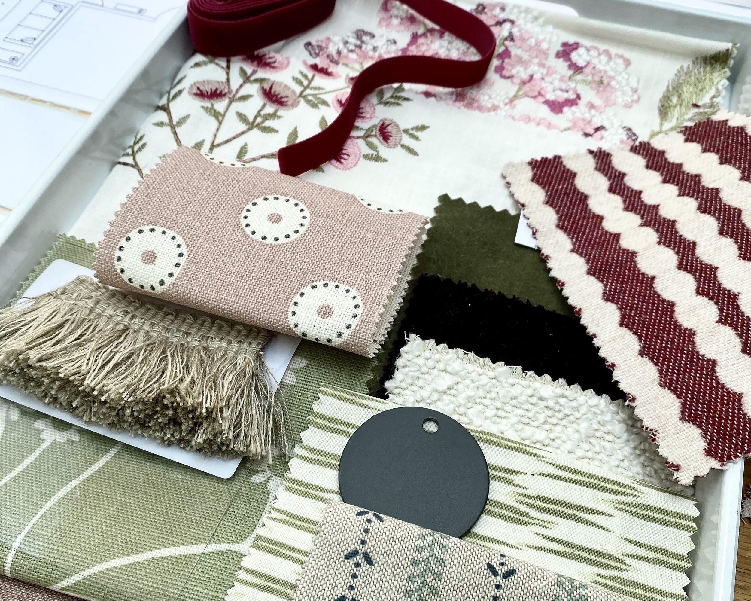
How to mix patterns & prints
Video tutorial on how to mix patterns successfully in your home

Best paint colours for north-facing rooms
Before embarking on painting any room, no matter the direction, be sure to always consider these key questions:
Who uses the space and how do they want to feel in the space? Thinking about who uses a room the most – home-workers, children, grandparents - and how they want to feel in the space – focussed, energised or relaxed for example - are key considerations to ensure the colours your chose create the right ambience.
Then think about what time of day the space is most used. Is it used for breakfast and then everyone leaves the house for the day? Or perhaps it’s the late afternoon sun that draws people into the room.
And, mostly importantly - Direction, direction, direction?! Which way does the room face? Because yes, it matters! Here’s why

Fabulous fabrics to warm up your home this autumn
I frequently get asked for advice about furnishing fabrics, often as part of a complete home or room re-design or sometimes simply in the context of a room refresh, when new curtains or a new sofa fabric is required. Here I share some of my recent finds, new to the market, that will help cosy up your interiors this autumn.

WFH - putting ‘home’ first again
So here we are; each of us in our new normal. For months we have made-do – working at the kitchen table juggling for space with our partners, surrounded by our kids. We have pushed aside the general detritus of everyday living to make space for laptops, monitors & lever-arch files.
It’s been novel, it’s been funny, it’s been infuriating – it’s given birth to a whole host of comedy-gold moments on what not to do during a zoom meeting. But now some of us are returning to the office. Some of us are making our homes our new, permanent place of work. Many of us are doing a bit of both.
So where does that leave our homes?

8 tips to help with a narrow living room
By mid-January this year I’d received two pleas for help dealing with long, narrow living rooms. Had it been a tricky Christmas I mused, picturing older relatives perched in a row trying to enjoy a long-awaited post lockdown catch-up, while children race up and down the length of the room with nerf guns blazing?
It’s true – this type of space can be difficult to lay out and decorate – but with some careful thought and a little visual trickery, these rooms can be turned from feeling like a bowling alley cum train carriage into a comfortable, welcoming space you will enjoy for years to come.
Here are my top tips:

5 interior trends (or new classics?) for 2022
I started this post with the title ‘5 interior trends for 2022’ and the obligatory sentence or two about it being okay to not follow trends (and an admission that I tend not to, preferring a slowly-curated interior). But as I continued to write I realised that, with the exception perhaps of No.1 Colour, these aren’t or shouldn’t be ‘trends’ these should become ‘mainstays’ - classics for the long term. Read on and let me know what you think.

An Optimistic Blue - Colour of the Year 2022
Last week Dulux announced its Colour of the Year 2022. Bright Skies is described as ‘an airy and fresh tone that opens up and breathes new life into any space’ it may indeed be the perfect colour to cheer us through the upcoming months of winter – and in the lyrics of Isaac Waddington we will see ‘bright skies cutting through the rain’. Let’s take a look . . .