
Pattern Play
Mixing patterns in interiors: a creative guide to mastering the art
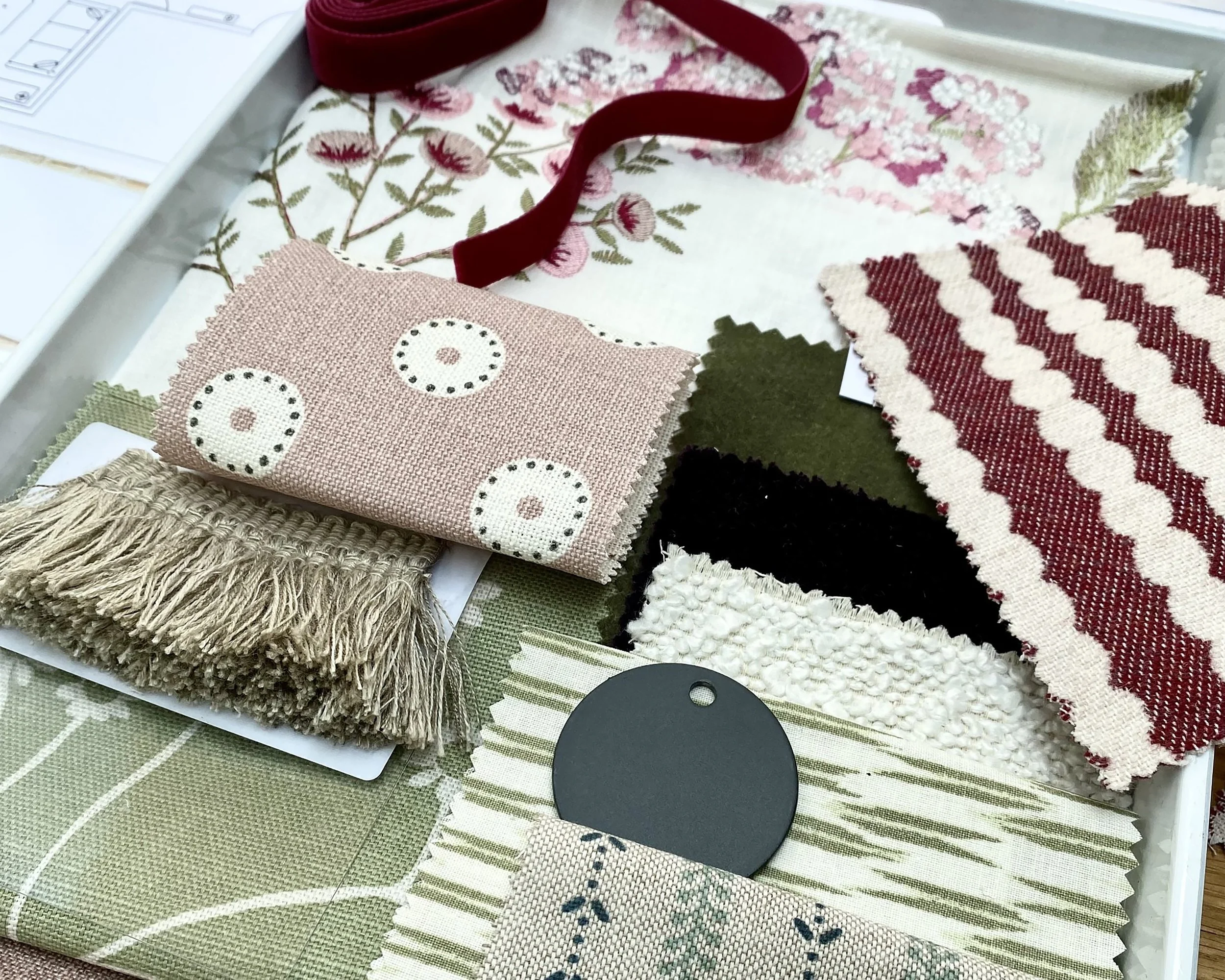
Pattern swatch box
Perusing the interior magazines in my local supermarket recently, I was struck by just how joyous interiors are looking at the moment. Whether it was images of a farmhouse kitchen, a new-build en-suite or a hallway in a 1970s semi, these spaces were drawing me in and making me smile with every page turn. And the reason? Pattern. It is everywhere and it’s pretty glorious! On walls, ceilings, floors and windows and every conceivable piece of furniture, pattern is finding its place.
Pattern mixing can feel daunting, but when done right, it elevates a space with texture, depth and personality. Whether you’re going for a bold maximalist look or something more subtly layered, successfully combining patterns requires intention and a touch of playfulness.
So if you are looking to introduce more pattern at home but are a little unsure as to how to go about it, read on for my guide to harmonious pattern clashing.
Consider the overall aesthetic
Before diving into fabrics and swatches, define the overall feel you want the room to evoke. Is it cosy and eclectic? Clean and modern? Traditional with a twist? Your aesthetic will guide your pattern choices. For instance, an English country look might blend florals, trellis and checks, while a contemporary space may rely more on geometric motifs and cleaner lines.
Credit: OKA
Choose fabrics before paint
One common pitfall is selecting the wall colour first, then struggling to match textiles to it. From experience I know that it’s far easier to match paint to fabrics than the other way around. And if you are completely unsure of what paint colour to choose, the colours in your selected fabrics will help guide you.
Pick your hero
Identify one key pattern to lead the space. This “hero” fabric—be it a graphic print, a statement stripe or a bold floral—should be the foundation from which all other patterns take cues. From here, you can layer in secondary prints that complement rather than compete. The goal is to have a visual focal point, not a battle of patterns.
Credit: Prestigious Textiles
Limit the colour palette
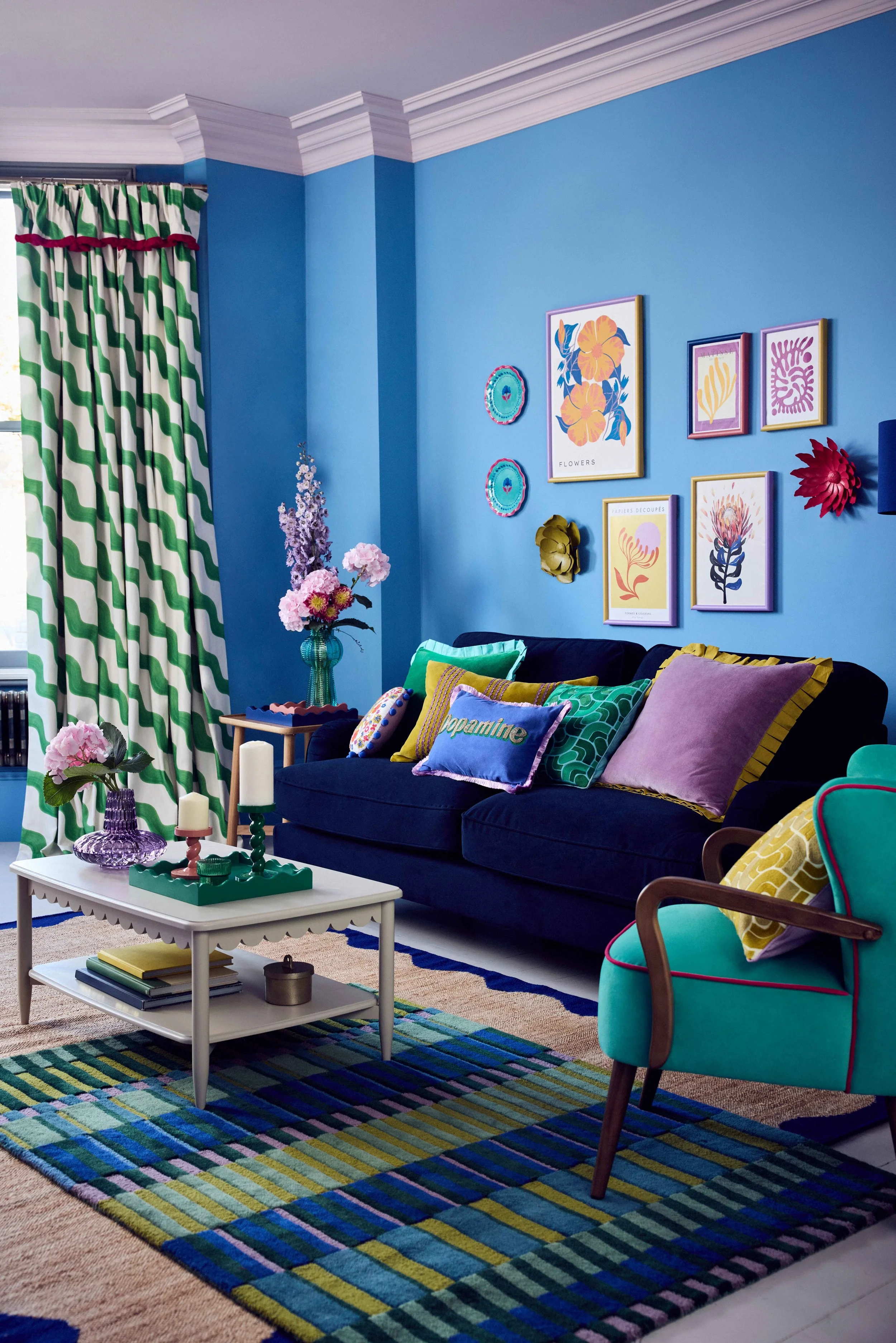
Too many colours in a room full of pattern can quickly overwhelm. So don’t overdo the number of colours in your scheme. Ideally select three or four key hues—and repeat them throughout your chosen patterns. This thread of colour will tie disparate prints together and make the overall scheme feel intentional, not accidental.
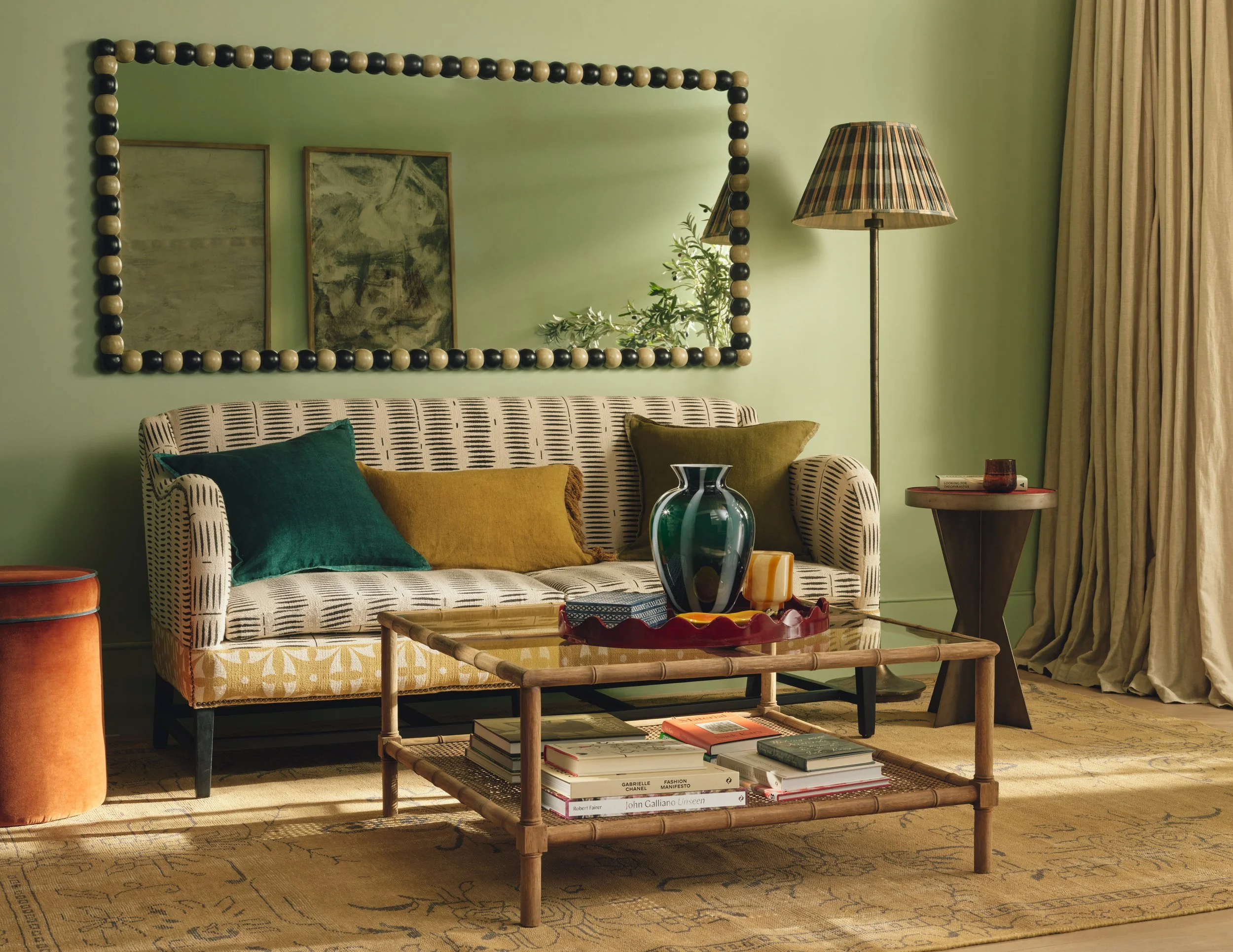
Vary the scale of patterns
A vital principle in pattern mixing is scale variation. Combine large-scale prints with smaller, more intricate ones to create contrast and visual interest. For example, pair a bold botanical print with a petite polka dot or fine stripe. Avoid using multiple patterns of similar size—they’ll compete instead of complementing one another. A good rule of thumb is the ‘rule of three’ – start with one large scale pattern and then introduce medium sized pattern and small scale pattern.

Bedroom scheme by Rintoul Holt Interiors
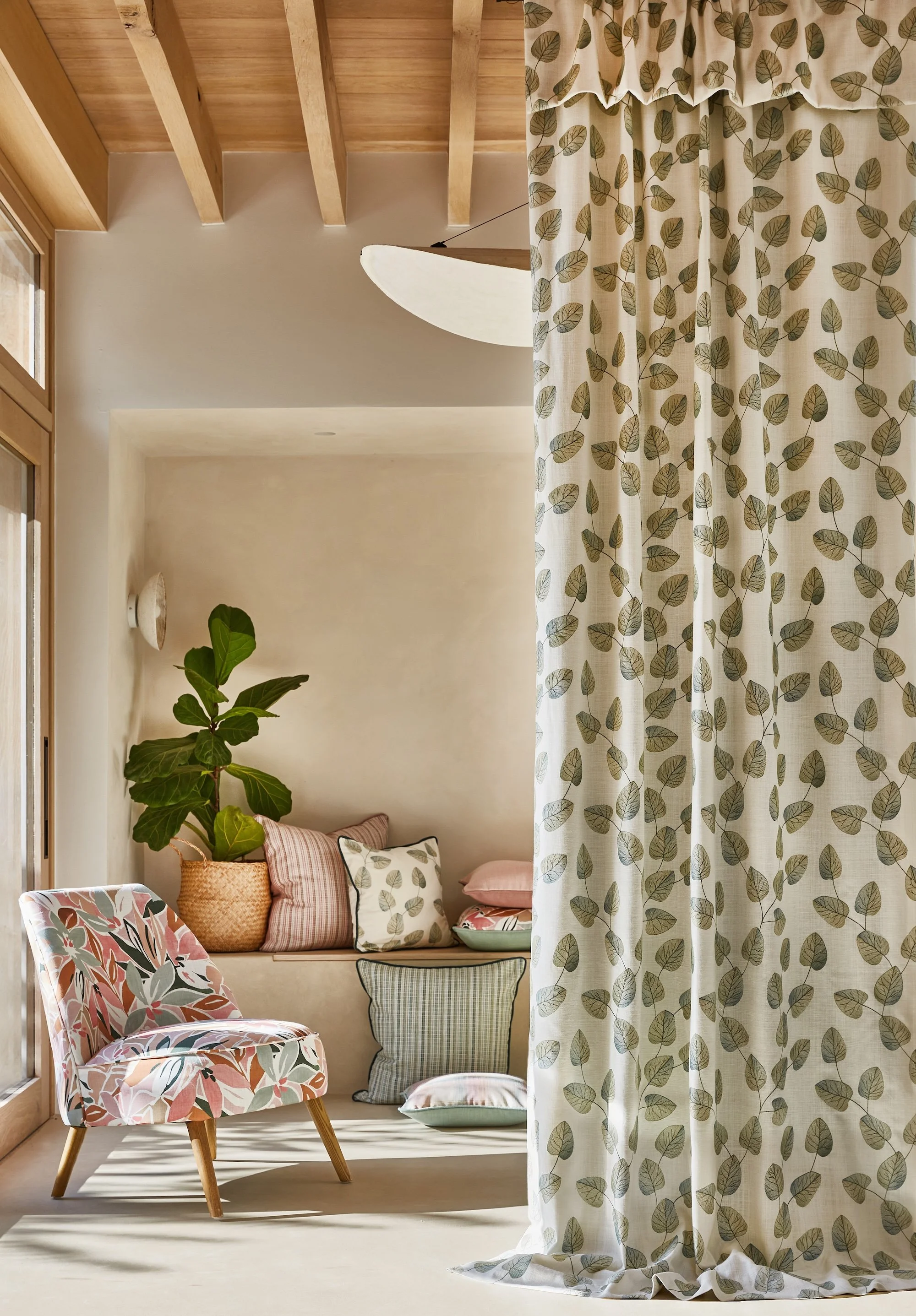
Consider the surface
Pattern scale should align with the size of the surface it covers. Large motifs work well on expansive areas like curtains, rugs or walls, while smaller prints are better suited to cushions or lampshades. A pattern that looks striking on a sample can feel overpowering when applied too liberally in a tight space, so it’s always a good idea to test the fabric in context. Many fabric houses offer large returnable samples and these are brilliant for allowing you to see the pattern repeat and how the fabric will sit in the room.
Layer patterns thoughtfully
Layering is where the magic happens. If you feel stuck start with a base layer (like a rug), then introduce textiles - cushions, throws and curtains, each with varying textures and prints. Don’t forget that a herringbone flooring, a veined quartz worktop or the tiles around a fireplace all count as pattern too. Wall art, ceramics and books can bring in additional layers of pattern and colour.
Think texture
It’s really important to mix texture as well as pattern, think velvet against linen, wool beside cotton. Texture enhances pattern. Combining rough with smooth, shiny with matte or thick with fine adds sensory contrast. In cooler months, try wool, velvet and faux fur for warmth and depth, while summer might call for linen, cotton, and raffia for a breezier look.

Mixing the textures. Credit: OKA
Build a mood board & edit, edit, edit!
Creating a mood board or swatch box helps you visualise how all the elements will work together. Collect fabric samples, paint swatches, tiles and inspiration images. Step back and assess—what feels out of place? Are the proportions balanced? Editing is just as important as selecting; sometimes it’s about what you leave out.
Add space to breathe
While mixing patterns is exciting, restraint is essential. Plain surfaces—whether a neutral wall, a solid-coloured sofa, or a bare wood floor—act as visual pauses and prevent overwhelm. They give the eye a place to rest and allow your patterns to stand out more effectively.
Most importantly, have fun!
Credit: Dunelm
Interiors are meant to be expressive. Pattern mixing is your chance to showcase personality and tell a story through design. Don’t be afraid to experiment. Rules are there to guide, not restrict. If you love it, it works.